Visualization
Descriptors on a set of given materials could be displayed as a heatmap, which helps you to understand the descriptor-property relationships. This tutorial will show you how to draw a heatmap.
Descriptor heatmap
We will use Composition and density as the descriptors and target property, respectively, for a step-by-step demonstration of how to draw a heatmap.
calculate descriptors
from xenonpy.datatools import preset
from xenonpy.descriptor import Compositions

samples = preset.mp_samples
cal = Compositions()

descriptor = cal.transform(samples['composition'])
sort descriptors by property values
# use formation energy as our target
property_ = 'density'

# --- sort property
prop = samples[property_].dropna()
sorted_prop = prop.sort_values()

# --- sort descriptors
sorted_desc = descriptor.loc[sorted_prop.index]
draw the heatmap
# --- import necessary libraries

from xenonpy.visualization import DescriptorHeatmap

heatmap = DescriptorHeatmap(
        bc=True,  # use box-cox transform
        save=dict(fname='heatmap_density', dpi=200, bbox_inches='tight'),  # save figure to file
        figsize=(70, 10))
heatmap.fit(sorted_desc)
heatmap.draw(sorted_prop)
Here, we explain how to read the descriptor heatmap.
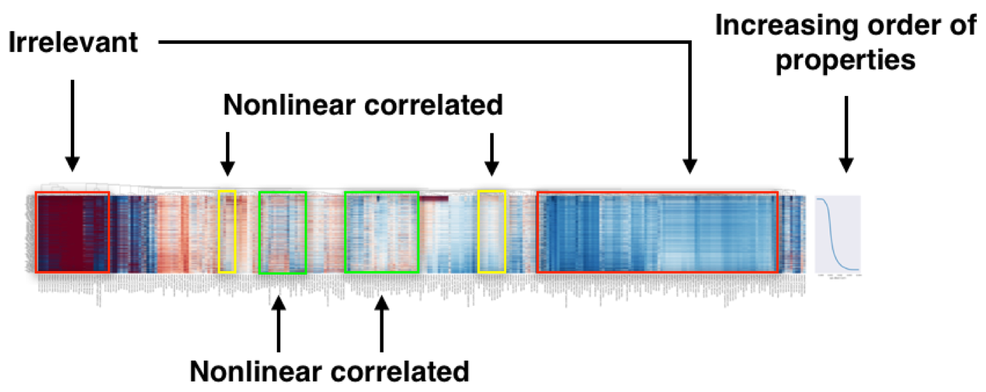
Heatmap of ~70,000 compounds with 290 compositional descriptors sorted by their property’s value.
In the heatmap of the descriptor matrix, the materials are arranged from the top to bottom in the increasing order of density. Plotting the descriptor-property relationships in this way, we could visually recognize which descriptors are relevant or irrelevant to the prediction of formation energies. Relevant descriptors, which are linearly or nonlinearly dependent to formation energies, might exhibit certain patterns from top to bottom in the heatmap. For example, a monotonic decrease or increase pattern would appear in a linearly dependent descriptor. On the other hand, irrelevant descriptors might exhibit no specific patterns.
You can test run using this sample code: